Tables hid the decision path
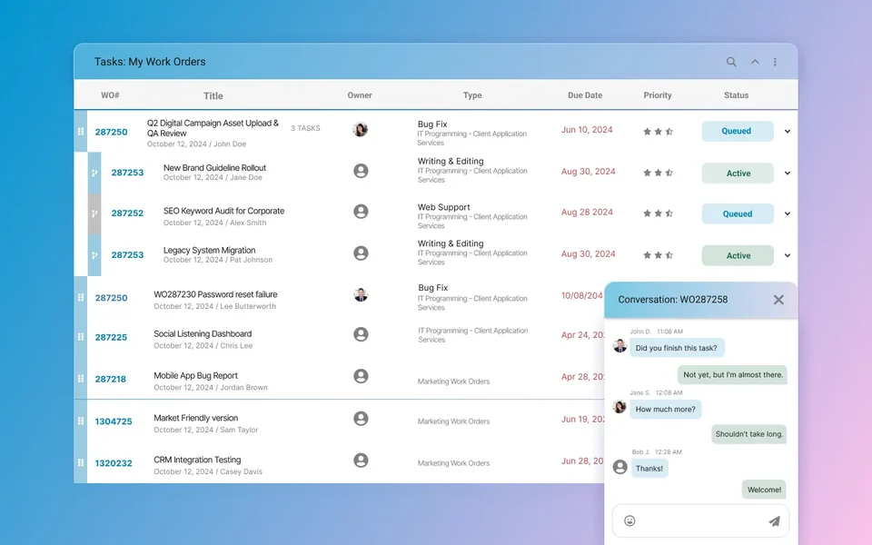
In the old dashboard, priority, assignment, and next-step information appeared across multiple columns rather than as one action hierarchy.
Internal redesign · release not disclosed
I led a three-month UX redesign of an internal maintenance dashboard: grouping work-order details for triage, moving chat beside the task, and designing cards for mobile use.
Project study / Davies role · 2023-presentEnterprise product UX
Workflow analysis, responsive UX and interface design
The original dashboard spread priority, owner, status, and next actions across multiple columns. On mobile, the table required horizontal scrolling to see those details.
I reorganized the information for scanning and updating work orders, designed a mobile card view, and brought chat into the detail panel. I worked with the in-house product and IT teams.
Compared
Existing and redesigned paths were compared for the placement of status, ownership, and next actions.
QA
Desktop table and mobile card behavior were reviewed separately across target breakpoints.
Themes
Recurring questions about status, ownership, and next steps informed the interface problem definition.
Evidence noteDirectional findings come from workflow comparison, responsive QA, and support-theme review; no production analytics are claimed.
In the old dashboard, priority, assignment, and next-step information appeared across multiple columns rather than as one action hierarchy.
At mobile widths, the table required horizontal scrolling and did not isolate the fields selected for the field workflow.
Users could see labels, but the interface did not clearly communicate what each state meant or what action belonged to it.
Communication and work order state appeared in separate surfaces, leaving their relationship implicit in the interface.
Work orders moved between people, statuses, and locations. Each handoff needed a visible owner and next action.
The documented requirements called for overview density on desktop and compact task context, updates, and less horizontal movement on mobile.
Notes and chat were not secondary features. They explained why a work order changed and what needed to happen next.
The dashboard places priority, status, location, owner, and due signals in the same order on each row.
Communication was placed beside the work order it affects so the message and the task state remain visible in the same interface.
Summary, tasks, notes, files, and activity became separate but connected areas. This preserved depth without making one long screen carry every interaction.
Cards compress the same work order into a field-friendly shape: status, priority, location, due date, and next action stay visible without horizontal scrolling.
The redesign began by separating scan tasks, update tasks, and detail tasks. Each view was then shaped around the job it needed to support.
High-level lists show what matters for triage. Detail views expand into notes, files, chat, and history only when the user needs that context.
Mobile screens use cards and grouped fields, not squeezed tables. Responsive QA checked this pattern separately from the desktop table.
Color and label rules were used to distinguish urgency and progress without relying on color alone.
Cards share spacing, label, and action rules across desktop summary areas and mobile views.
Notes, summary, chat, and files use consistent containers that keep each type of supporting context in a defined area.
Desktop keeps the power of structured rows, while smaller breakpoints switch to readable card patterns.
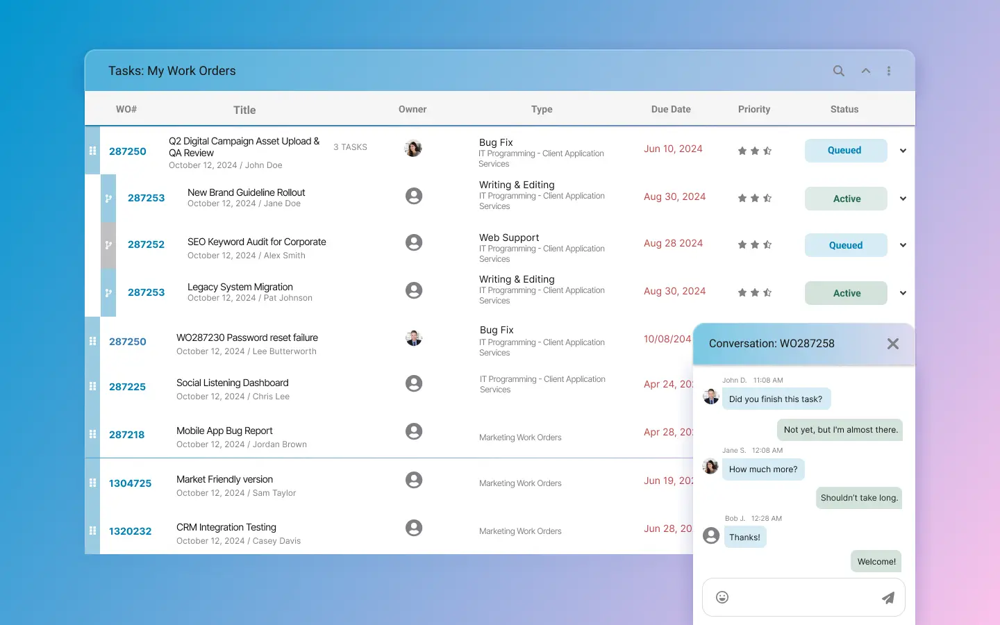
The dashboard groups the information needed to scan, decide, update, and review a work order.
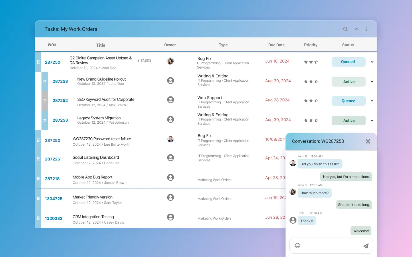
The chat window sits inside the work order context, keeping messages and task state on the same surface.
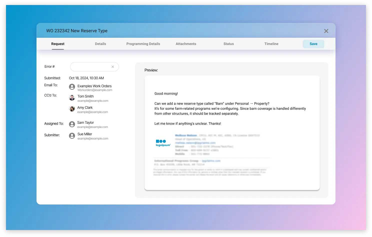
Tabbed content keeps summary, notes, details, and related task information structured instead of overwhelming the page.
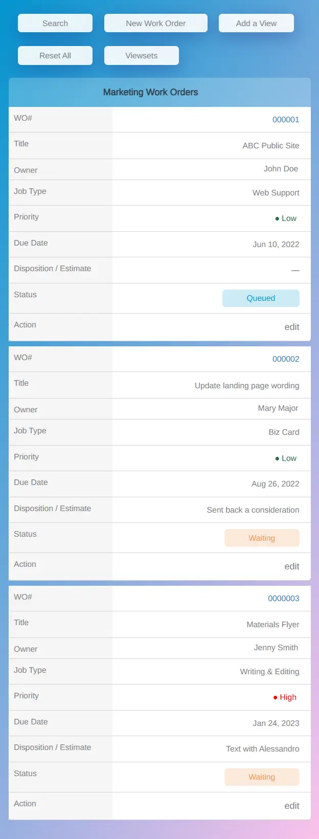
The mobile view presents the selected field-workflow details and actions in cards instead of a compressed desktop table.
Priority, ownership, status, and the next action appear together in the redesigned workflow instead of being distributed across dense columns.
The mobile card model presents the fields and actions selected for field use instead of compressing the desktop table.
Status meaning, ownership, and next-step context are made explicit in the redesigned screens; production impact has not been measured.
Existing and redesigned task paths were compared for how they expose priority, ownership, status, and the next available action.
Desktop table behavior and mobile card behavior were reviewed separately because each breakpoint supports different work.
Confusion points were tracked against UI support themes, especially around status meaning and next-step clarity.
Looking back
The mobile layout forced a useful decision: which fields belong in the list, and which can wait until someone opens a work order? I kept status, priority, location, due date, and the next action on the card.
Workflow comparison and responsive QA helped review that choice. They do not establish whether people complete work faster; that would need testing with users or production data.