Service discovery depended on dense navigation
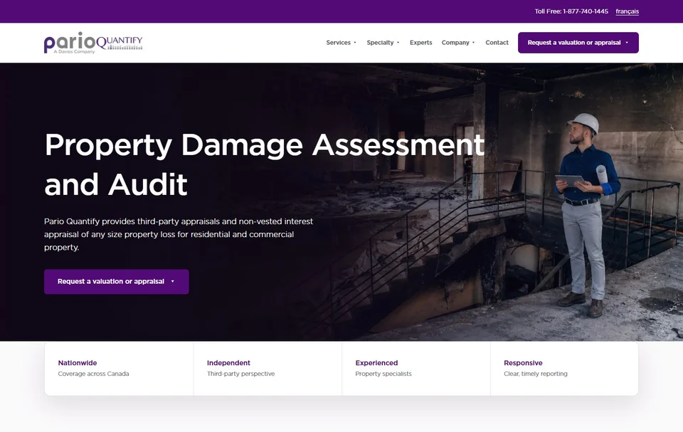
The live header exposed a large taxonomy in a narrow space. Labels, nested services, specialty content, experts, company pages, and request actions competed for attention.
Staged /demo preview
I designed and built a bilingual website revamp with nine reusable templates and a migration catalog of 191 CMS page records. The connected /demo site is staged for review.
Project study / 2026 staged buildBilingual CMS and website revamp
Content audit, UX/UI, responsive frontend and Razor/CMS template implementation
ParioQuantify serves insurers, property specialists, legal teams, and people who need an independent assessment after property loss. The existing website held valuable service content, but its navigation, page hierarchy, and responsive patterns did not make that expertise easy to scan.
I audited the content, designed the page and navigation patterns, and implemented the responsive layouts in Razor and XHTML. I kept review routes under /demo so stakeholders could compare the revamp with production before release.
191
The revamp catalog maps 105 English and 86 French page records.
9
Home, services, service details, content, listings, people, articles, contact, and request forms share one system.
EN + FR
Route-aware navigation and page content support both languages through equivalent patterns.
Evidence noteCounts come from the CMS migration catalog and template inventory; rollout remains staged.
The live header exposed a large taxonomy in a narrow space. Labels, nested services, specialty content, experts, company pages, and request actions competed for attention.
Large headings and wide text blocks did not always create a clear reading path. Visitors could understand the copy but still miss related services or the next useful action.
Desktop navigation, nested menus, long service names, request forms, and bilingual labels all created edge cases that could not be solved by shrinking the desktop layout.
With 191 page records in scope, repeated one-off fixes would increase inconsistency and make the next content update expensive.
Audit review, appraisals, catastrophe response, dispute resolution, contents valuation, legal support, and specialty work each needed a clear route without flattening important sub-services.
Production content and established URLs had to stay available while the redesign was reviewed. The new experience needed an isolated preview path and a reversible rollout plan.
Editors needed reusable placeholders and predictable templates. A polished homepage alone would not solve service pages, expert profiles, articles, forms, or bilingual maintenance.

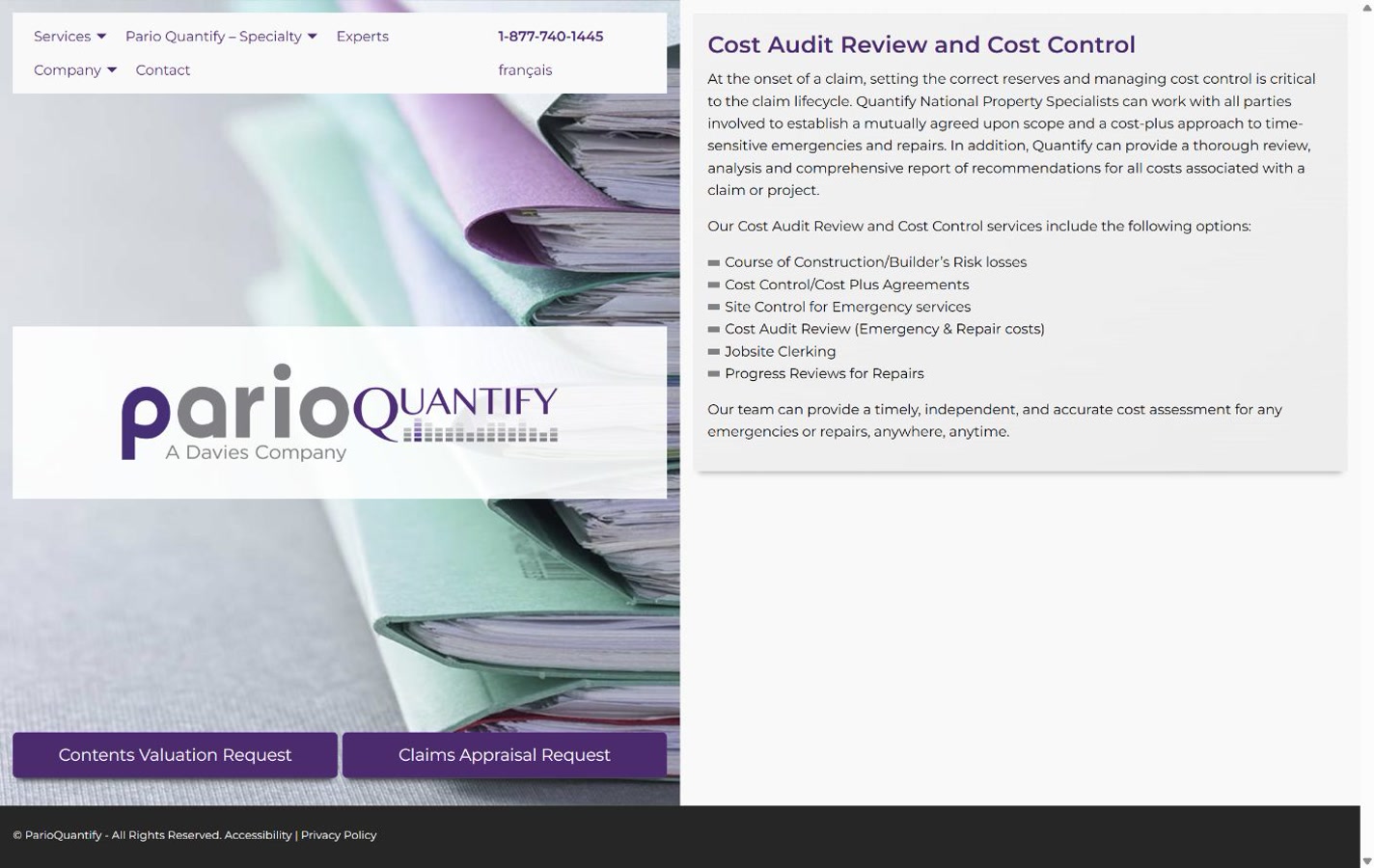
Current capture: the live ParioQuantify service page. Revamp capture: the CMS preview staged under /demo for review in 2026.
The service label and heading identify the page before the visitor reaches the detailed copy. The image sits within a smaller, defined area.
The introduction moves from a wide centered block into one column with a shorter line length and explicit content sequence.
A sidebar links to related services so visitors can continue without reopening the main menu.
Replacing production pages during review would interrupt established routes. I isolated the new templates and internal links under /demo. The service-page comparison above shows the live page alongside its staged counterpart; rollout remains staged.
The catalog contains 191 CMS page records, so I built nine reusable Razor templates for home, services, service details, content, listings, people, articles, contact, and request forms. Shared styles and optional content regions keep page structure consistent while allowing editors to update the content.
English and French service labels needed room in desktop and mobile navigation. I retained the service taxonomy and used route-aware disclosures with compact rules for long labels and touch targets. The mobile capture shows the language switch and menu above the service heading.
Existing pages, navigation labels, service relationships, forms, expert records, metadata, and bilingual content were inventoried before visual changes were applied.
New templates and navigation were rooted under /demo so stakeholders could compare old and new experiences without replacing production URLs.
I implemented the layouts in Razor and XHTML, with shared Tailwind styles, navigation, and scripts to check the migrated content.
ParioQuantify purple, teal, neutral surfaces, typography, spacing, borders, and container widths are encoded once in the Tailwind theme.
Templates render optional regions only when meaningful CMS content exists, preventing empty shells and editor workarounds.
Dedicated navigation rewrites internal links under /demo so the revamp can be reviewed as a connected website before launch.
Validation scripts check content shape, bilingual people records, migration output, and generated CSS before release.
This staged counterpart retains the service content and shows the revised heading, navigation, request action, and related-service links. The before-and-after comparison uses the same route.

The image, heading, copy, and onward link illustrate a reusable content region. The count of nine ParioQuantify templates comes from the documented template inventory, rather than this screenshot.

The English service-page capture shows the français language switch, compact menu, service heading, and introduction at a 375px viewport. It documents this layout, not a user-test result.
The staged /demo route made the redesign navigable as a complete site while the current production experience remained intact.
The documented output includes nine Razor templates, shared styles, and a migration catalog of 105 English and 86 French CMS page records. These are delivery counts, not visitor outcomes.
The staged templates provide stronger page orientation, readable content measures, and contextual routes to related services and requests; live visitor impact is not yet claimed.
Matching service routes were captured at desktop and mobile sizes so hierarchy, content parity, and responsive behavior could be compared directly.
English page content was exported and compared to source records, with structured checks for missing or mismatched regions.
People data, page records, wording, and generated CSS run through repeatable validation commands before release.
Looking back
The content inventory shaped the design. Service pages, expert profiles, articles, and forms needed different structures, but they could share navigation, spacing, and editing rules.
The prototype lets stakeholders follow links and compare both languages before release. Visitor testing is still needed to establish whether the revised navigation helps people find the right service.