Different surfaces competed for clarity
Product messaging, feature explanation, customer proof, and conversion paths all needed space. Without structure, pages could become noisy.
Shipped marketing work
I designed homepage, product page, and email work for Lone Wolf Technologies, with reusable page sections and responsive WordPress production support.

Project study / Oct 2020-Jun 2023Marketing web design
Website and campaign design, responsive layout rules and WordPress production support
At Lone Wolf, I designed marketing pages for software used by real-estate agents and brokers. I worked with marketing, SEO, and web stakeholders on homepage and product page layouts, reusable sections, and email design.
My production support covered responsive layout rules and WordPress sections that could accommodate CMS content updates. The examples below show delivered design work; internal campaign details and performance data are not included.
3
A homepage, a product page, and an email design.
CMS
The page system had to remain usable inside real WordPress content and production workflows.
Rules
Hero, feature, proof, product, and conversion sections follow repeatable content and layout rules.
Evidence noteThe homepage, product page, and email examples document delivered work. No individual effect on reach, conversion, or revenue is claimed.
Product messaging, feature explanation, customer proof, and conversion paths all needed space. Without structure, pages could become noisy.
Repeated content types needed consistent layout rules so teams could create pages without reinventing hierarchy each time.
Generic marketing sections would not explain the product ecosystem well enough. The design had to make complex offerings easier to compare and understand.
WordPress and production workflows required components that were flexible but not so open-ended that they lost consistency.
The homepage introduced the software offering. Product pages needed space for features, supporting proof, and a clear next action for agents and brokers.
I carried typography, content hierarchy, and calls to action across page designs and email layouts while adapting them to each format.
Headlines, feature copy, images, and calls to action had to work with changing CMS content. My production support addressed section structure and mobile stacking.
Page structure separated what the product is, who it serves, why it matters, and what action comes next. This made complex SaaS messaging easier to scan.
Repeated sections were designed with predictable rules for headline length, supporting copy, proof points, and responsive behavior.
The interface direction favored clarity over decorative density. Enterprise users and buyers need confident structure, not excessive visual noise.
Design decisions were checked against actual implementation needs so the final surfaces could stay close to the intended system.
Each surface was evaluated by what it needed to help a visitor do: understand the offer, compare value, trust the brand, or take the next step.
Hero sections, proof bands, feature blocks, product cards, and CTA areas were treated as system pieces rather than one-off page decorations.
Frontend constraints shaped the design rules. The goal was a system that could be built, maintained, and extended.
Hero, feature, proof, and conversion sections followed clear layout rules so new pages could be assembled without losing quality.
Cards helped organize product families and feature explanations while keeping comparison behavior predictable.
Large SaaS pages need strong mobile stacking rules. Content was grouped so sections remained readable at smaller breakpoints.
The system favored practical constraints: reusable fields, controlled section options, and layouts that could survive real content updates.

This map shows the recurring sections: hero, features, product cards, proof, and calls to action.

My product page layout separates the offer, features, supporting proof, and calls to action so each has a defined place in the page.
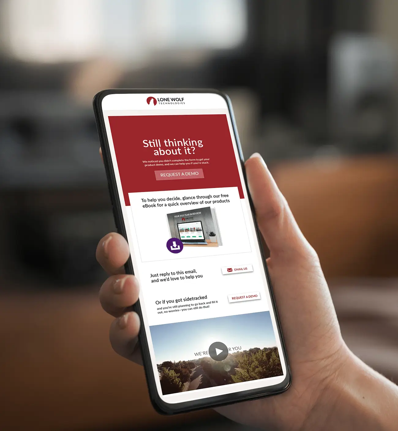
My email design carries the website typography and content hierarchy into a campaign format. This example shows the design output; campaign results are not included.
I designed the homepage and product page layouts shown here, organizing the offer, features, supporting proof, and calls to action.
I designed reusable page sections and email layouts that carried typography and content hierarchy across website and campaign work.
I supported WordPress implementation with responsive layout rules and reusable sections designed for CMS content updates.
Sections were evaluated by whether they could support repeated content without becoming too generic or too rigid.
Layouts were checked against the constraints of real web production, including CMS content length and breakpoint behavior.
The content hierarchy was reviewed for whether a visitor could understand the surface quickly without reading every paragraph.
Looking back
Repeated sections still need room for different messages. A product explanation, a customer quote, and a campaign offer each ask for a different balance of text and imagery.
My contribution covered page design and production support. These examples show that work; they do not establish an individual effect on conversion or revenue.