I designed and coded Pario.ca, giving engineering and environmental services a clear visual structure, with direct paths to service information, specialist expertise and requests.
End-to-end website design and coding, including responsive frontend and CMS implementation
Pario provides forensic engineering and environmental services. Someone arriving with a loss or investigation needs to understand the available expertise and find the right next step.
I owned the design and coding from the page layouts through the responsive frontend and CMS implementation. Content and translations were supplied by others. This case compares the archived May 2023 site with the current public website.
Working with
Content and translation supplied by others
Scope
Information hierarchy, navigation, expert discovery, responsive design and bilingual page templates
Tools
HTML/CSS, JavaScript, Razor/CMS templates
Services
Understand the offer
Service categories and detail pages explain the available disciplines.
Experts
Find a specialist
The directory brings discipline, province and office filters together.
EN + FR
Bilingual website
English and French pages share the navigation and visual structure.
EvidenceThe archived and current pages document a delivered website change. No measured improvement in enquiries, task completion or conversion is claimed.
02 / Problem
Expertise was present. The path to it was less clear.
01
Several ways into the site competed in the header
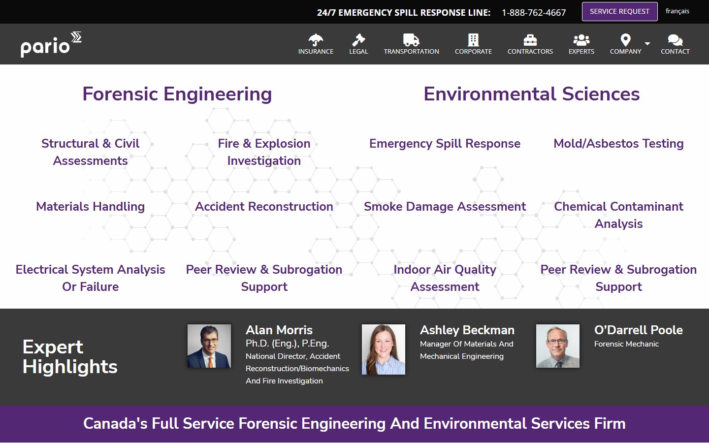
The 2023 archive combines audience links such as Insurance and Legal with service menus. These are different ways of describing the same business, but their relationship is not explained at the entry point.
02
The homepage moved quickly into dense service lists
Two columns of engineering and environmental links put a large part of the catalog on screen at once. This showed breadth, but gave little help deciding where to begin.
03
The next action needed more emphasis
Finding a specialist and requesting service are central visitor tasks. The redesign makes both visible in the homepage introduction and carries them into the shared navigation.
Project context
A specialist service with several entry points
Visitors may know the incident, the discipline or the expert they need. The website must support those starting points without expecting everyone to understand the full organization.
Existing content had to remain useful
The redesign works with detailed service descriptions, expert profiles, office information and a bilingual CMS. A stronger homepage still needs useful pages behind it.
Before and after
From a service directory to a focused homepage.
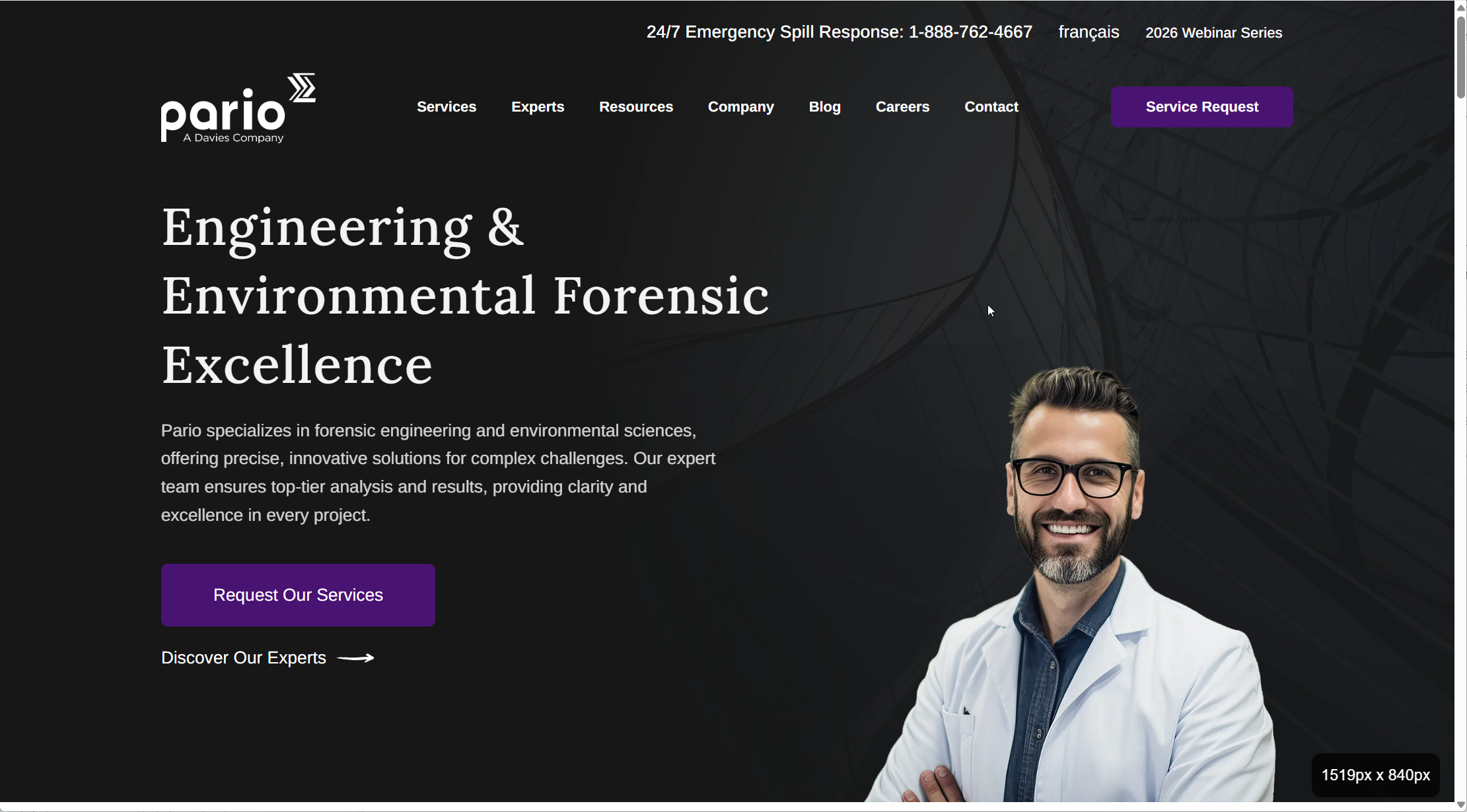
The archived homepage leads with lists of engineering disciplines. The redesign introduces the engineering and environmental offer, then gives visitors direct paths to request service or find an expert.
May 2023 archiveCurrent Pario.ca
↔
Before: homepage capture from the May 31, 2023 Internet Archive snapshot. After: the supplied current Pario.ca homepage screenshot. Both fill the same frame without stretching, aligned at the top; the archive is cropped at the bottom. This is a visual comparison, not a usability study.
Introduce the offer before the catalog
The headline brings engineering and environmental services together. A short introduction explains the offer before visitors explore individual disciplines.
Make the next steps visible
A prominent service-request button and a separate expert-discovery link support two different needs: starting an enquiry and finding relevant expertise.
Use clear navigation categories
Services, Experts, Resources and Company organize the top-level navigation around recognizable destinations. The service-request action remains visible in the header.
03 / Design decisions
Structure, rhythm and a clear next step.
01
Use image and text as one reusable service region
The engineering section gives each part a distinct job: a large service image, a category label, a headline, a short explanation and one onward link. Alternating the image position lets the same region support successive topics without making the page feel repetitive.
02
Group services in the navigation
The Services menu separates forensic engineering and environmental disciplines. Group headings organize the catalog while retaining direct links to specialist services. Visitors who know the service they need can use that route without reading the homepage.
03
Carry the hierarchy into a single mobile column
The compact layout keeps the service introduction, request action and expert-discovery link in the reading flow. English and French pages share the structure; content and translation were supplied by others.
The mobile introduction gives the service message and both next steps room to read without showing an expert portrait.
Design process
Start with the visitor’s next decision
I organized the page hierarchy around understanding a service, identifying a relevant expert and making contact. This gave the navigation and homepage different jobs.
Carry the structure into the CMS
Shared page and navigation patterns connect the homepage to service content, expert profiles and bilingual pages. Responsive rules keep that structure usable at smaller sizes.
Reusable patterns
Shared navigation
Services, experts, company information and requests have consistent entry points across the website.
Reusable content regions
Image, heading, body copy and onward links repeat across service and corporate content, giving CMS pages a consistent visual structure.
Responsive reading order
On mobile, content follows a single column. The service introduction and request action remain prominent while the navigation collapses.
04 / Outcomes
What the current website makes possible.
Start from a service or a person
The website provides separate paths into the service catalog and expert directory, with a request action available for visitors ready to contact the team.
A consistent bilingual presentation
The English and French pages use shared layouts, navigation and action patterns across the corporate website.
A reusable visual structure for technical services
Image-led sections give service descriptions a consistent reading order and an onward link. These are delivered interface changes, not measured business outcomes.
How the work was reviewed
Archived-to-current comparison
The archived and current homepages document changes in navigation, the service introduction and calls to action. They show delivered content and layout changes, rather than measured usability outcomes.
Public page review
The current homepage, service overview, expert directory and French homepage provide evidence of the implemented structure. The mobile capture records the narrow-screen layout.
Evidence boundary
The public site shows what was delivered. A task-based usability study and enquiry data would be needed to assess whether visitors find the right expert more successfully.
Looking back
A specialist website has to balance breadth with direction. The full service catalog still matters, but it does not need to carry the entire introduction.
The next useful evaluation is specific: can a visitor find an expert for a given discipline and location, then begin a service request? That would test the two paths the redesign brings forward.