Work changed hands
Work orders moved between people, statuses, and locations. Each handoff needed a visible owner and next action.
Enterprise product UX
I led a three-month UX redesign of an internal maintenance dashboard: grouping work-order details for triage, moving chat beside the task, and designing cards for mobile use.
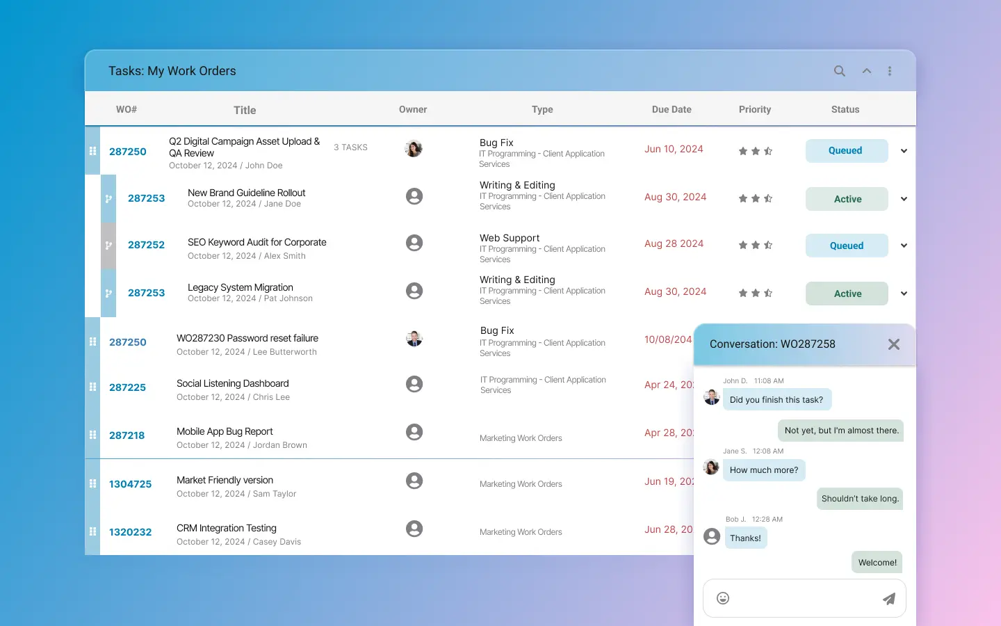
The original dashboard spread priority, owner, status, and next actions across multiple columns. On mobile, the table required horizontal scrolling to see those details.
I reorganized the information for scanning and updating work orders, designed a mobile card view, and brought chat into the detail panel. I worked with the in-house product and IT teams.
Evidence class
Observed evidence
Directional findings come from workflow comparison, responsive QA, and support-theme review; no production analytics are claimed.
Work orders moved between people, statuses, and locations. Each handoff needed a visible owner and next action.
Desktop needed a dense overview of work orders. Mobile needed the details and controls for updating a task without repeatedly scrolling sideways.
Notes and chat explained why a work order changed and what needed to happen next.
The old dashboard separated priority, assignment, and next steps across multiple columns, making them difficult to review together.
On a phone, users had to scroll sideways to reach work-order details and actions.
Reading a conversation alongside its work-order status required switching between views.
I mapped the information needed to scan work orders, make an update and review the full task. That determined which fields stayed in the list and which moved into the detail view.
The list shows the information needed to prioritize work. Notes, files, chat, and history sit in the detail view.
Mobile screens use cards with grouped fields. Responsive QA checked those cards separately from the desktop table.
I kept priority, status, location, owner and due signals in a consistent row order so people can compare work orders. Notes, files and full history stay in the detail view to preserve room for triage.
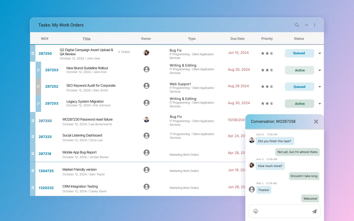
Dashboard overview
The dashboard groups the information needed to scan, decide, update, and review a work order.
Messages often explain a status change. I placed the conversation beside the selected work order so the message and the task it refers to can be read together, while the list remains available for context.
Contextual communication
Chat appears beside the work-order details, keeping messages and task status in view together.
Tabs separate the summary, tasks, notes, files, and activity within each work order. Each area stays available without lengthening a single detail screen.
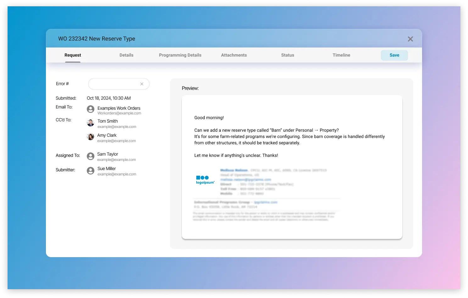
Detail view
Tabs organize the summary, notes, details, and related tasks within the work order.
A mobile card gives up some desktop density to keep status, priority, location, due date and the next action visible. Opening the work order provides the remaining detail without requiring sideways scrolling.
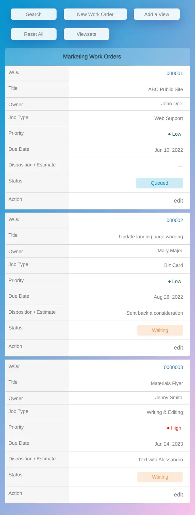
Mobile adaptation
The mobile cards present the details and actions selected for work in the field.
I compared where priority, ownership, status and next actions appeared in the original and redesigned flows.
I checked the desktop table and mobile cards separately, including which details and controls remained visible at each size.
I used recurring support questions about status and next steps to review the proposed labels and actions.
Delivered interface changes.
The redesigned workflow groups priority, ownership, status, and the next action so they can be reviewed together.
Cards keep status, priority, location, due date and the next action visible on a phone.
The redesigned screens spell out status meaning, ownership, and the next action. Production impact has not been measured.
The mobile card needed enough information for someone to decide what to do next. Keeping five fields visible meant moving notes, files and history into the detail view.
Workflow comparison and responsive QA helped me review that tradeoff. Testing with users or production data would be needed to determine whether it saves time.
Next: ParioQuantify Site RevampNext step
I’m a UI/UX & Web Designer. I design and build responsive websites and internal interfaces for insurance and B2B software teams.