Specialist services needed distinct routes
Audit review, appraisals, catastrophe response, dispute resolution, contents valuation, legal support, and specialty work each needed a clear navigation path that retained their sub-services.
Bilingual CMS and website revamp
I redesigned a bilingual property-services website, turning a 191-record content catalog into nine reusable CMS templates with clearer service navigation.
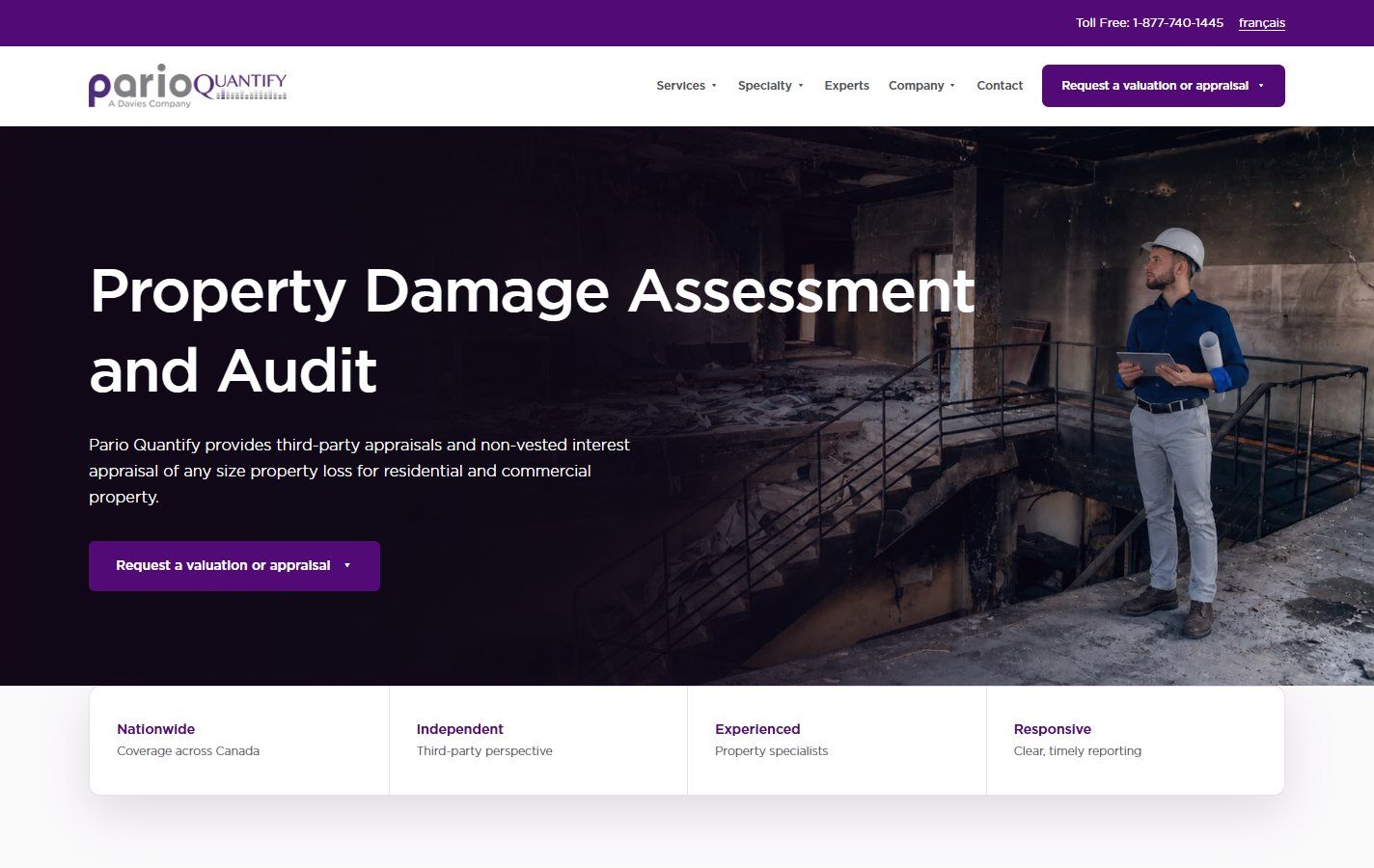
ParioQuantify helps insurers, property specialists and legal teams assess property losses. The site needed to explain closely related services without making visitors read the entire service catalog.
I audited the content, designed the navigation and page layouts, and built the responsive templates in Razor and XHTML. The implementation had to fit the existing CMS and support both English and French content.
Evidence class
Delivered output
The 191 records and nine templates are documented delivery counts; visitor impact has not been measured.
Audit review, appraisals, catastrophe response, dispute resolution, contents valuation, legal support, and specialty work each needed a clear navigation path that retained their sub-services.
The redesign needed to retain established service content and bilingual page relationships while changing how people moved between them.
Editors needed reusable placeholders and predictable templates for the homepage, services, expert profiles, articles, and forms, with a consistent way to maintain both languages.
The header packed service labels, nested services, specialty content, experts, company pages, and request actions into a narrow space.
Large headings and wide text blocks made the reading order unclear. Related services and next actions were easy to miss.
Navigation, nested menus, long service names, request forms, and bilingual labels each needed layout rules for smaller screens.
I gave the service introduction a narrower reading column and placed related-service links beside it. The heading identifies the service before visitors reach the detailed copy.


Drag the divider, tap the track, or focus the control and use the arrow keys.
The service label and heading identify the page before the visitor reaches the detailed copy. The image sits within a smaller, defined area.
The introduction moves from a wide centered block into a narrower column with a defined reading order.
A sidebar links to related services so visitors can continue without reopening the main menu.
I audited pages, navigation labels, service relationships, forms, expert records, metadata and bilingual content before designing the layouts.
I grouped the catalog into reusable page types before building the layouts. Service detail, expert, article and request pages each needed different fields and reading priorities.
I implemented the layouts in Razor and XHTML, with shared Tailwind styles, navigation, and scripts to check the migrated content.
A visitor assessing a property loss may need more than one service. I placed related-service links beside the introduction and kept the request action in the shared navigation, giving the page a clear onward path.
The homepage introduces the service offer
The homepage introduces property assessment, then directs visitors to services and the request form.
I organized the 191 records into nine templates: home, services, service details, content, listings, people, articles, contact and request forms. Optional regions let editors vary the content within each layout.

Service detail on mobile
The language switch, page heading and introduction remain in a clear sequence at a 375px viewport.
Service names and French labels need space to wrap. The compact menu and language switch sit above the service heading, while the introduction uses a single reading column.
Matching service routes were captured at desktop and mobile sizes so hierarchy, content parity, and responsive behavior could be compared directly.
English page content was exported and compared to source records, with structured checks for missing or mismatched regions.
People data, page records, wording, and generated CSS run through repeatable validation commands before release.
A reusable bilingual website.
The redesigned homepage and service pages are live, with shared navigation, bilingual content and service-request actions.
Shared styles and page structures support 105 English and 86 French CMS records.
The service template keeps a readable introduction, related services and the request action in defined places across the site.
The content inventory shaped the design more than any individual page. Different content types needed different structures, with shared navigation and editing rules.
The next evaluation should ask visitors to identify the right service and begin a request in both languages. That would test whether the revised structure helps them complete the task.
Next: Lone Wolf Marketing Web WorkNext step
I’m a UI/UX & Web Designer. I design and build responsive websites and internal interfaces for insurance and B2B software teams.